

Branding Laborup
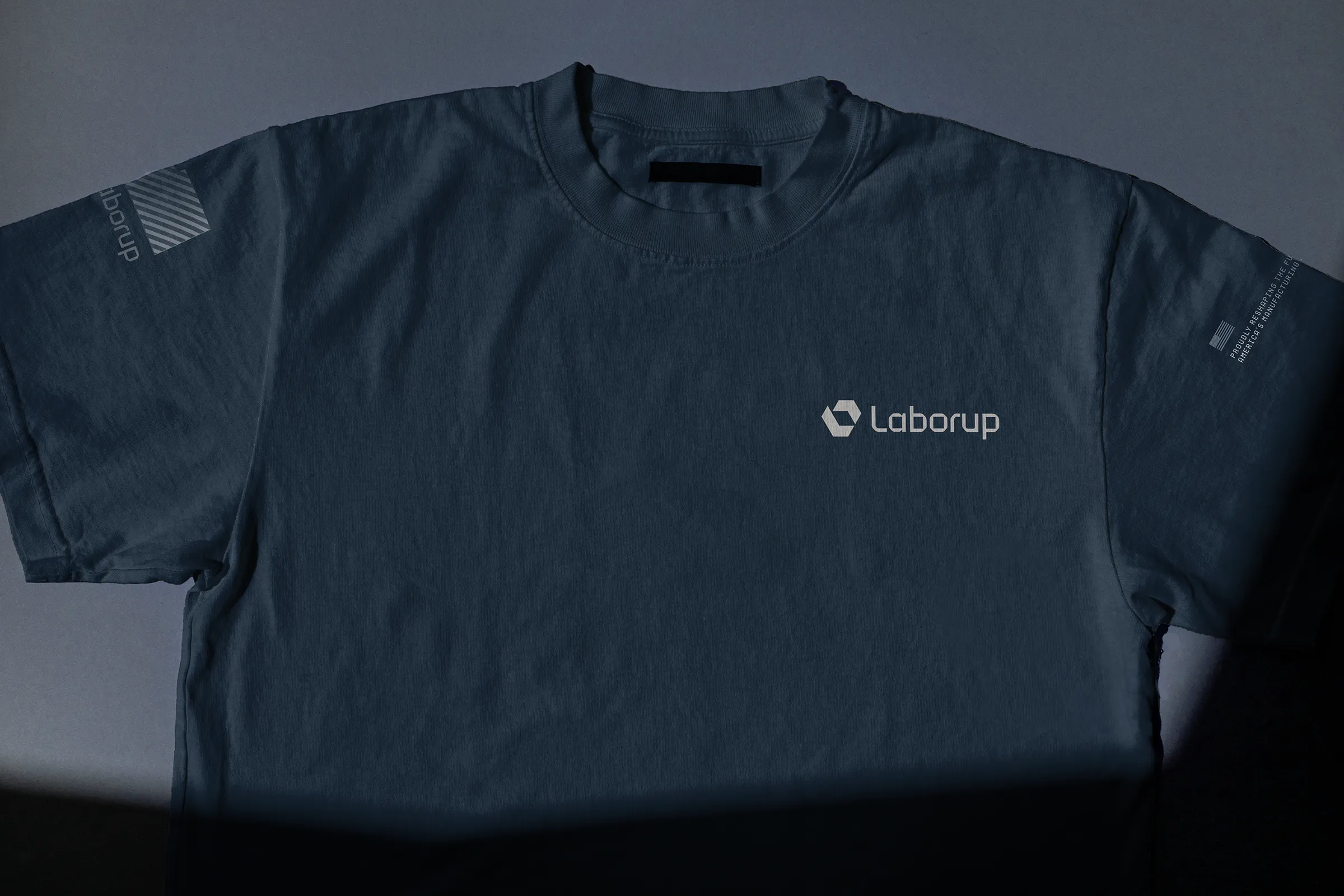
We wanted to move to something that felt unmistakably physical, industrial, and rooted in the world of the people we serve.


The Symbol
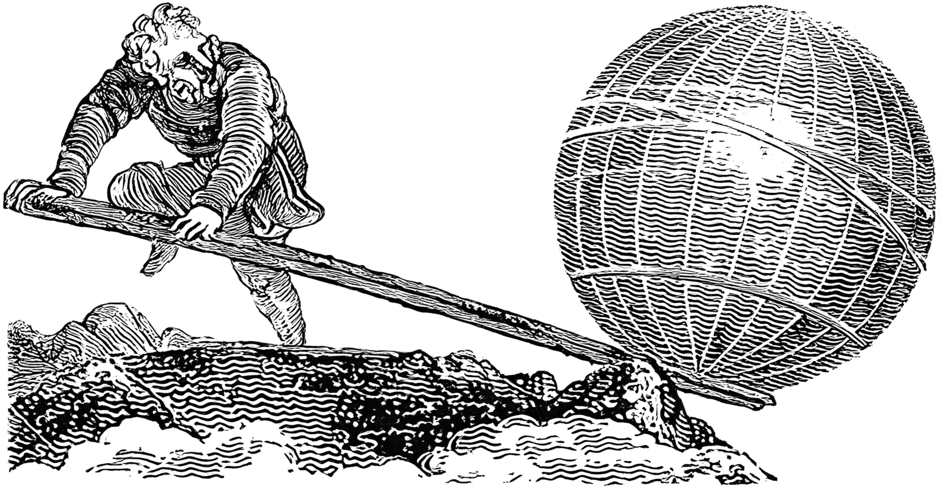
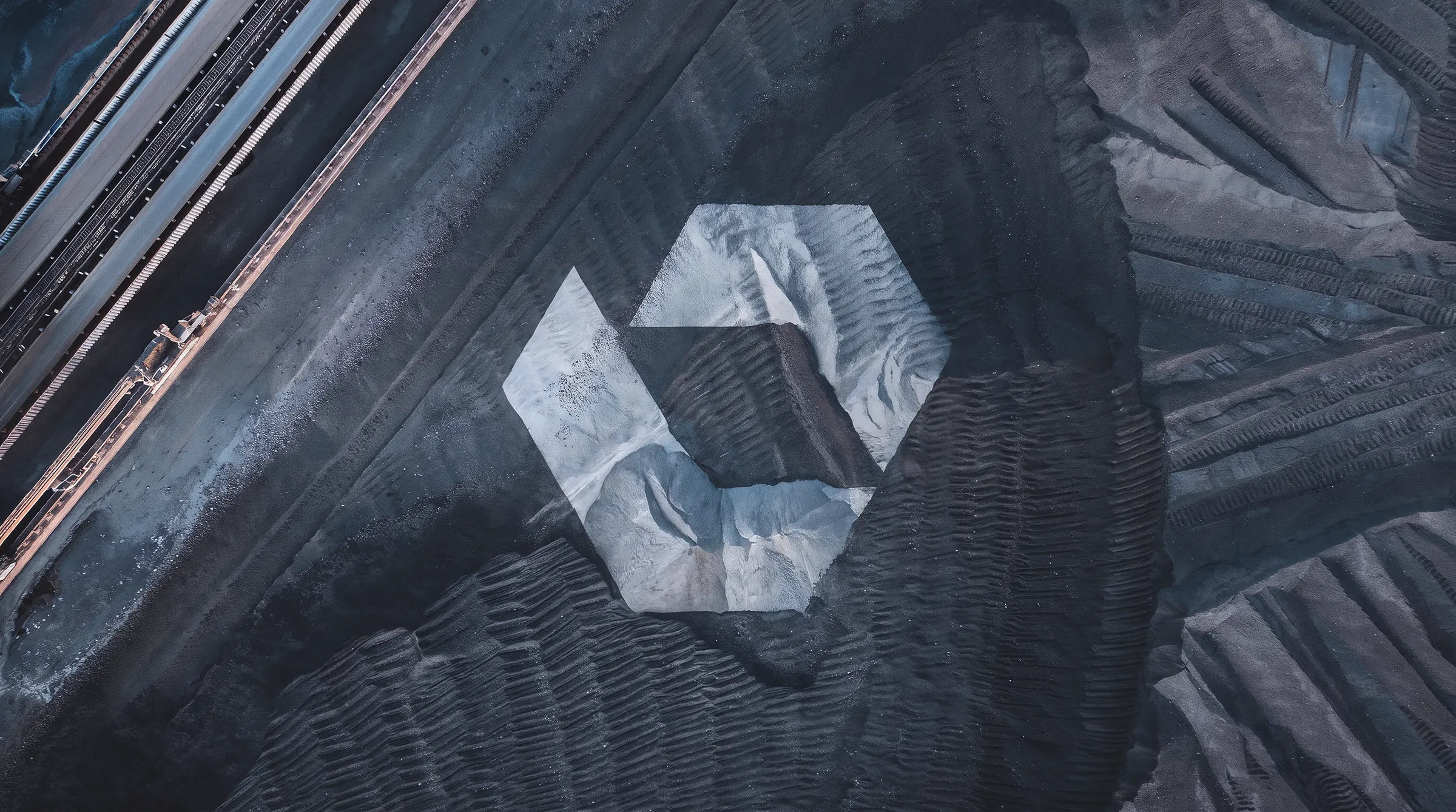
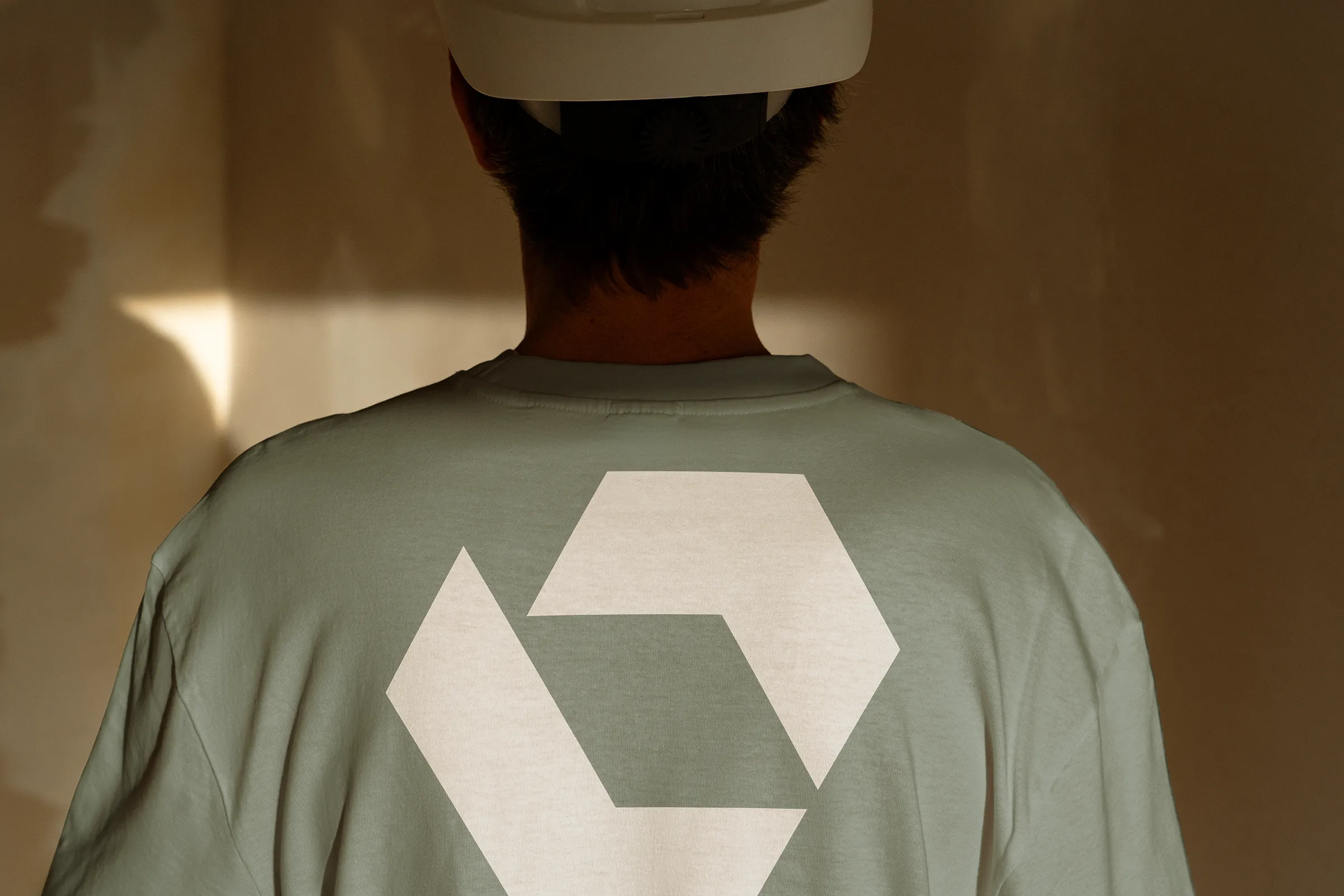
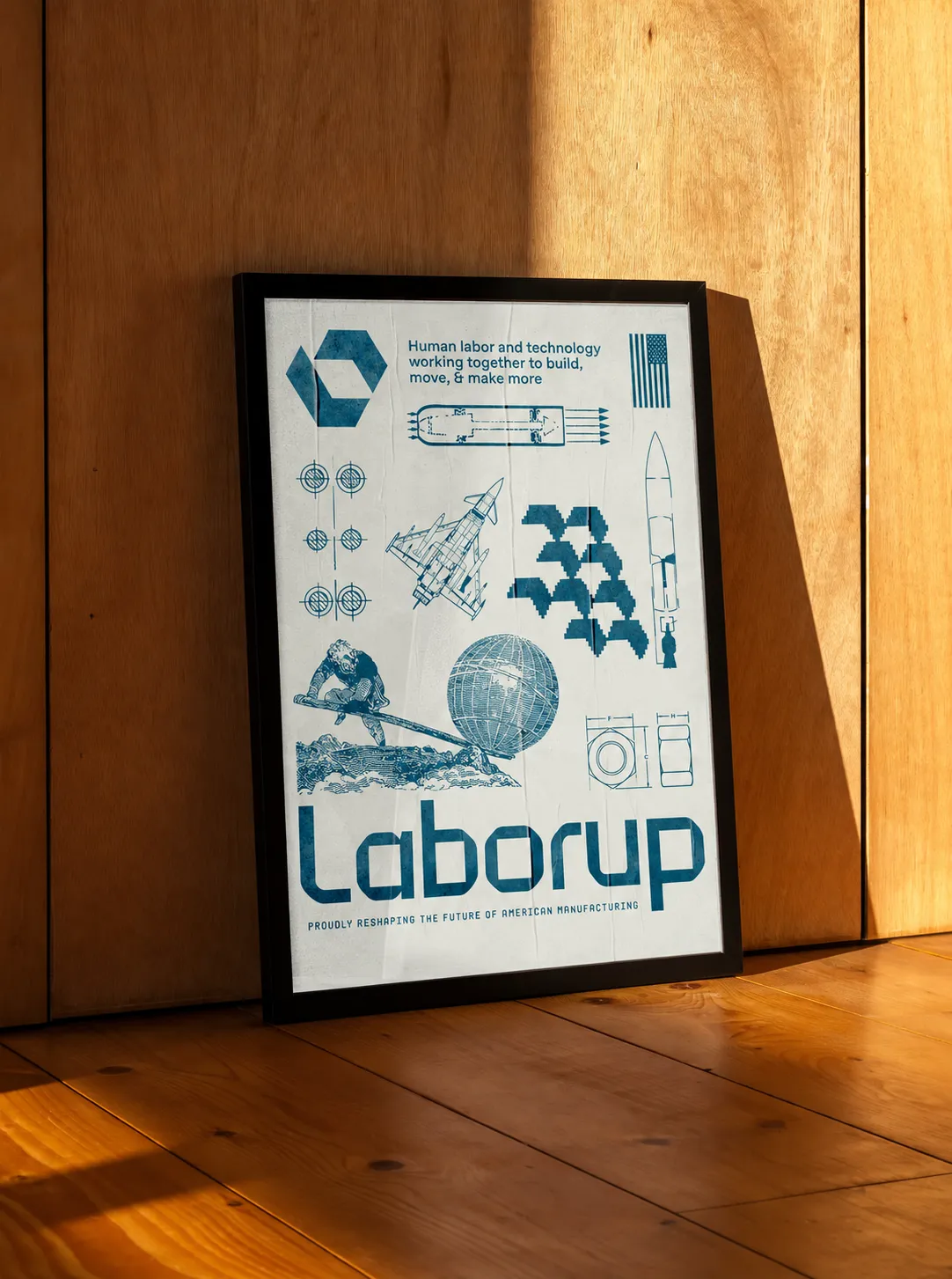
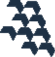
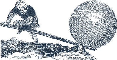
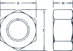
The mark pulls from the visual language of manufacturing, starting with the hexagon. Within it, the forms subtly suggest the L and upward arrow of Laborup, while nodding to Archimedes’ lever, one of the simplest expressions of human ingenuity and our ability to do more with the tools we build.
Combined, it becomes a symbol for modern manufacturing itself: human labor and technology working together to build, move, and make more.
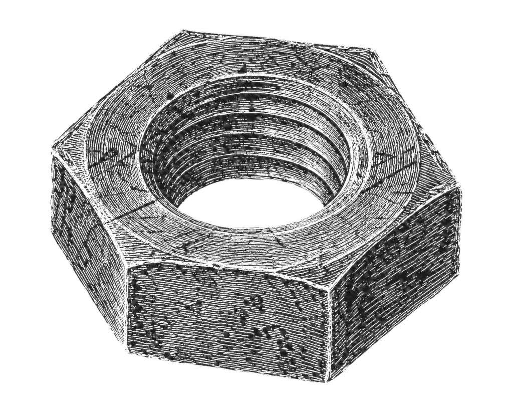




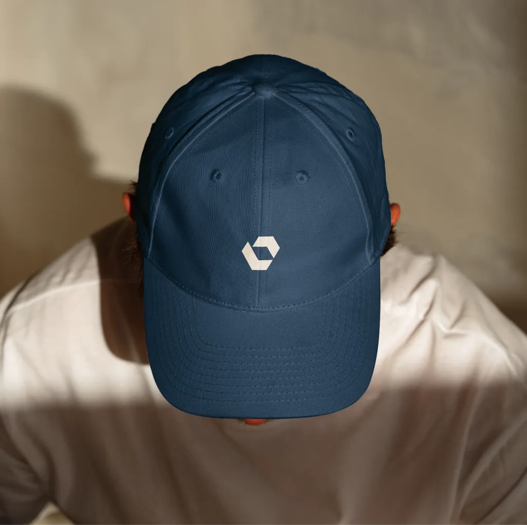
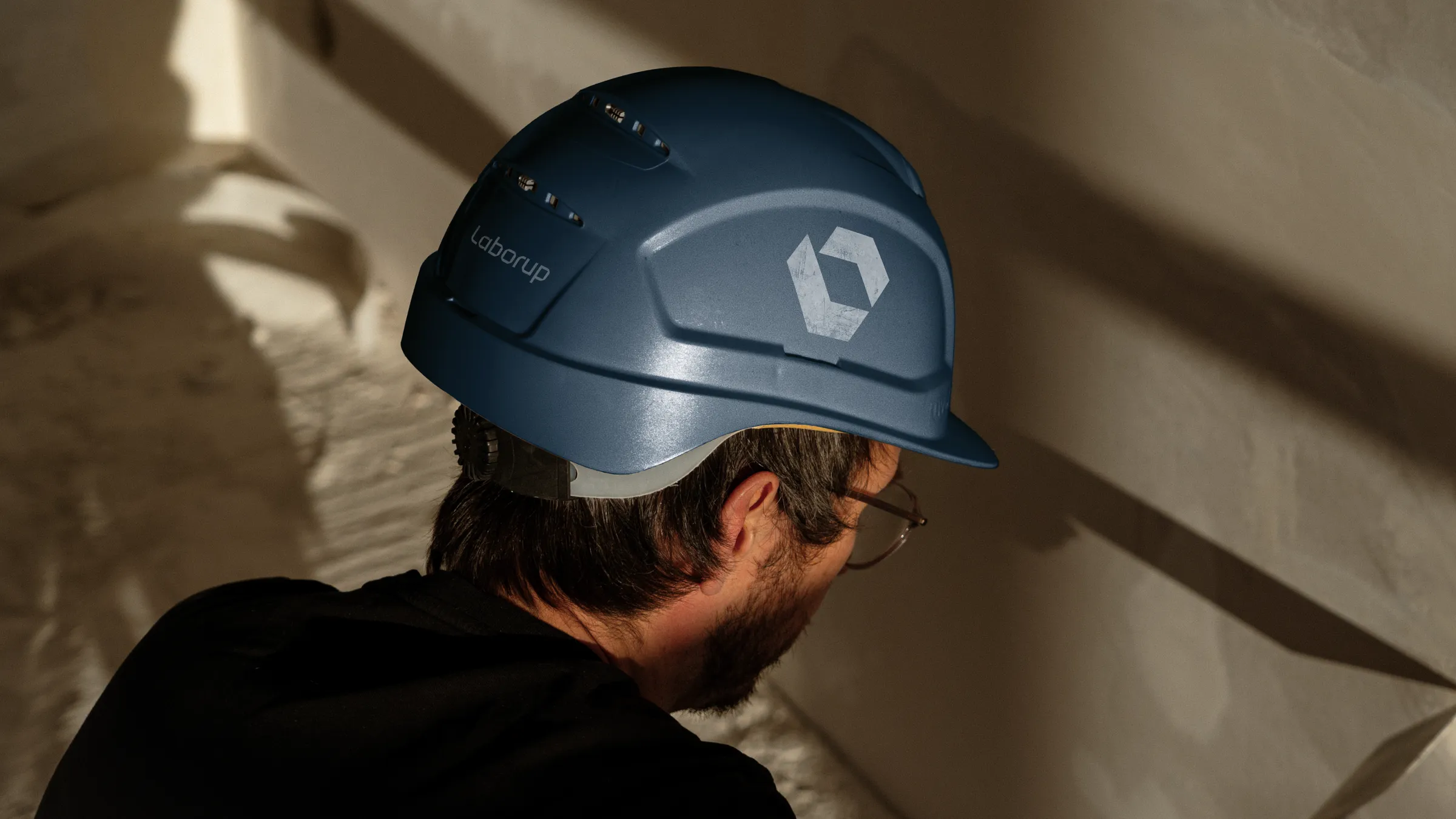
The resulting shape feels solid, machined, industrial and familiar.


The Wordmark
Machined parts often balance soft radii with hard, precise angles. CNC milling naturally creates rounded internal corners, while stamped and punched parts can create much sharper geometry.
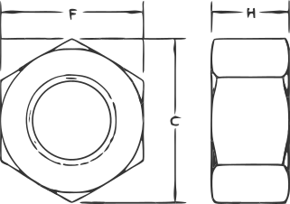
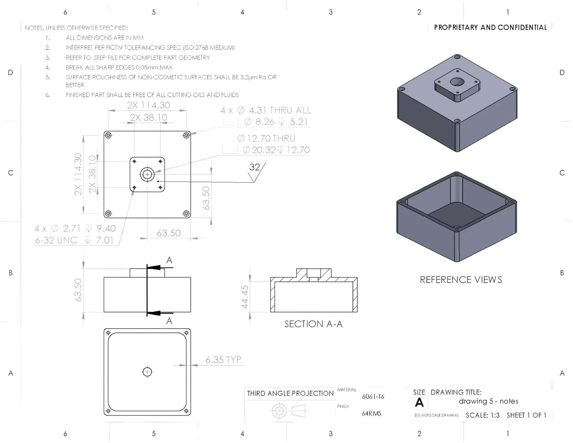
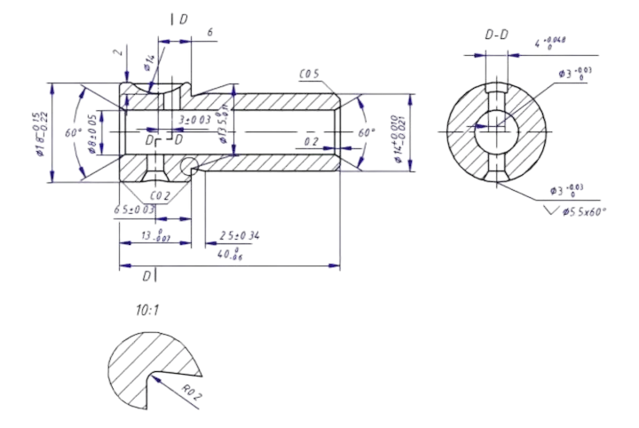



We carried that same contrast into the wordmark. This balance of angular and rounded gives it an industrial, machined feel, and adds a readable flow even at extreme sizes.



Typography, Color, and Brand
The type system carries that same industrial character but ultimately disappears. Favorit brings an elegant but engineered feel in headlines with flat cuts that quietly echo the mark’s geometry. Archimoto adds a utilitarian, technical vibe and Suisse does the simple, readable heavy lifting as the body text.
Archimoto
Favorit
Suisse does the simple, readable heavy lifting as the body text. This sample copy shows how Suisse reads across a few lines, from the spacing between letters to the rhythm of a paragraph.

We wanted the palette to feel grounded and durable, to reflect the heat, grit, of workwear and raw materials of industry.


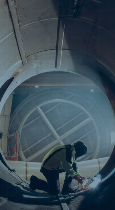
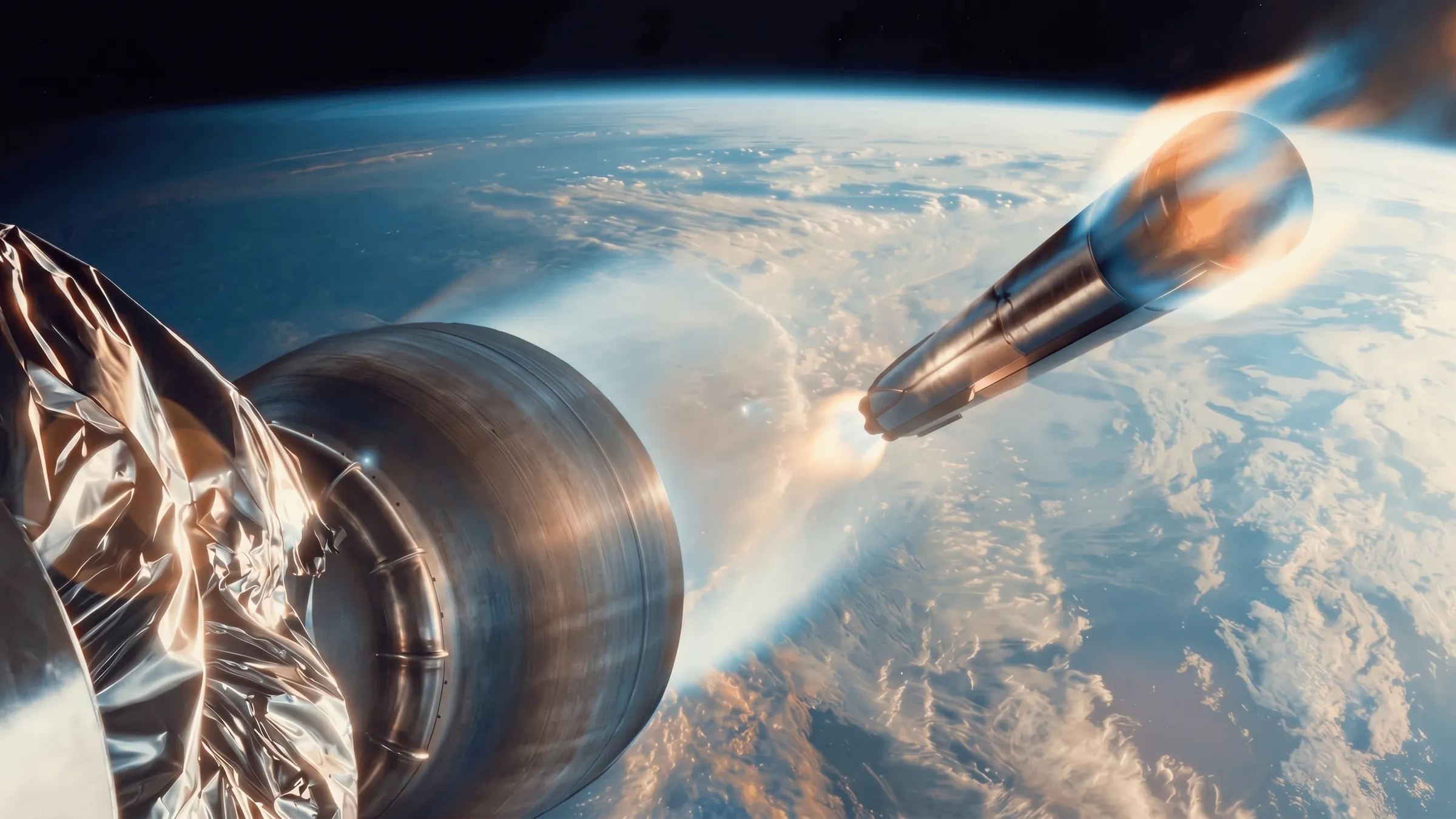
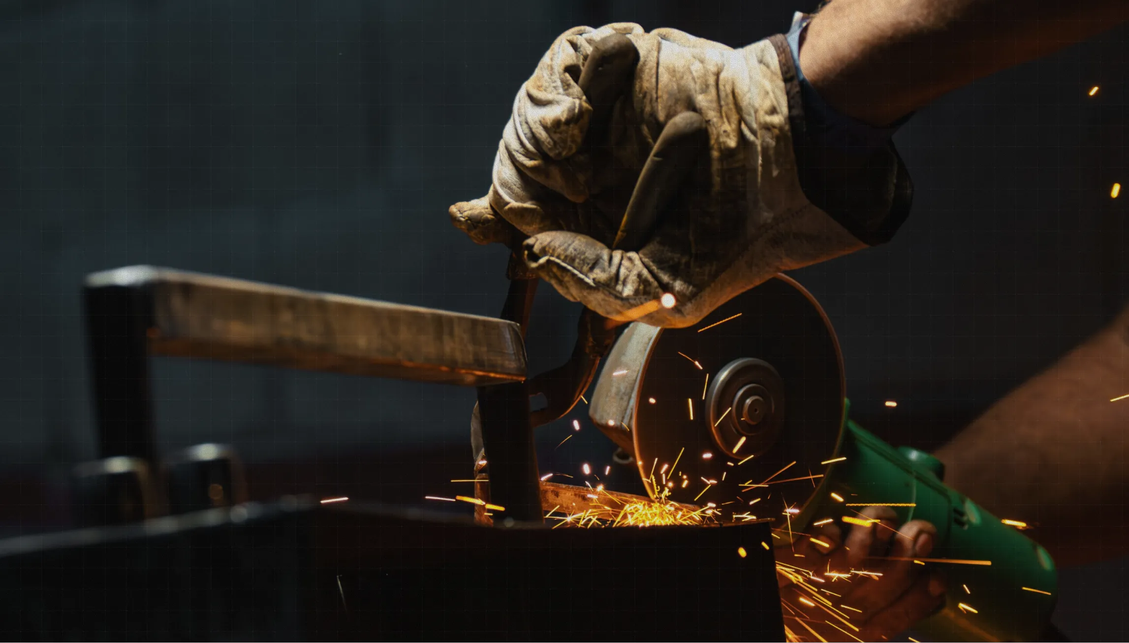
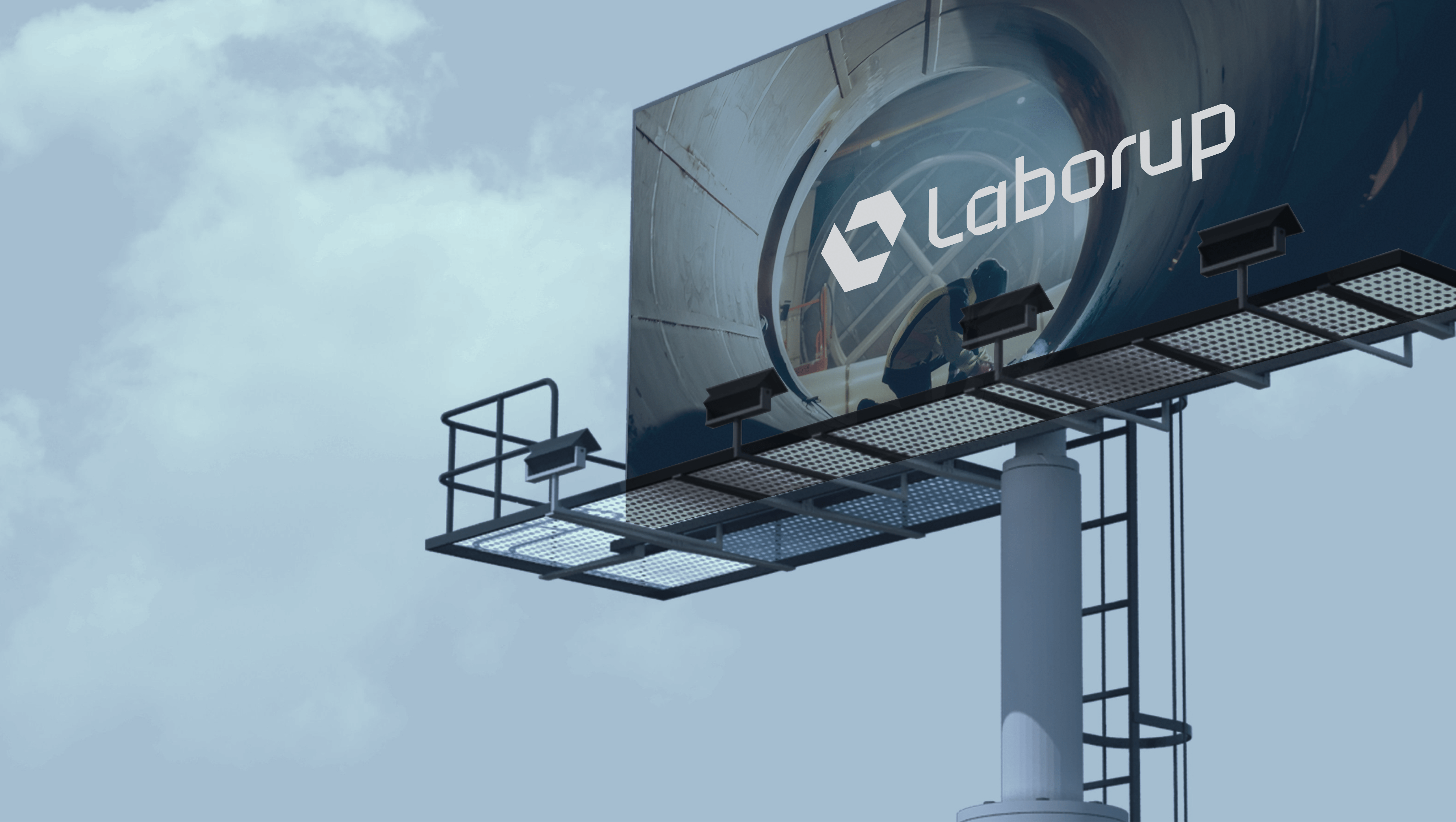
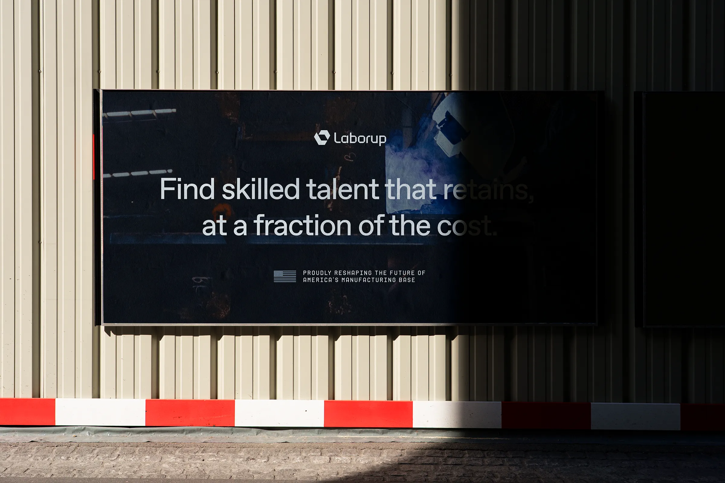
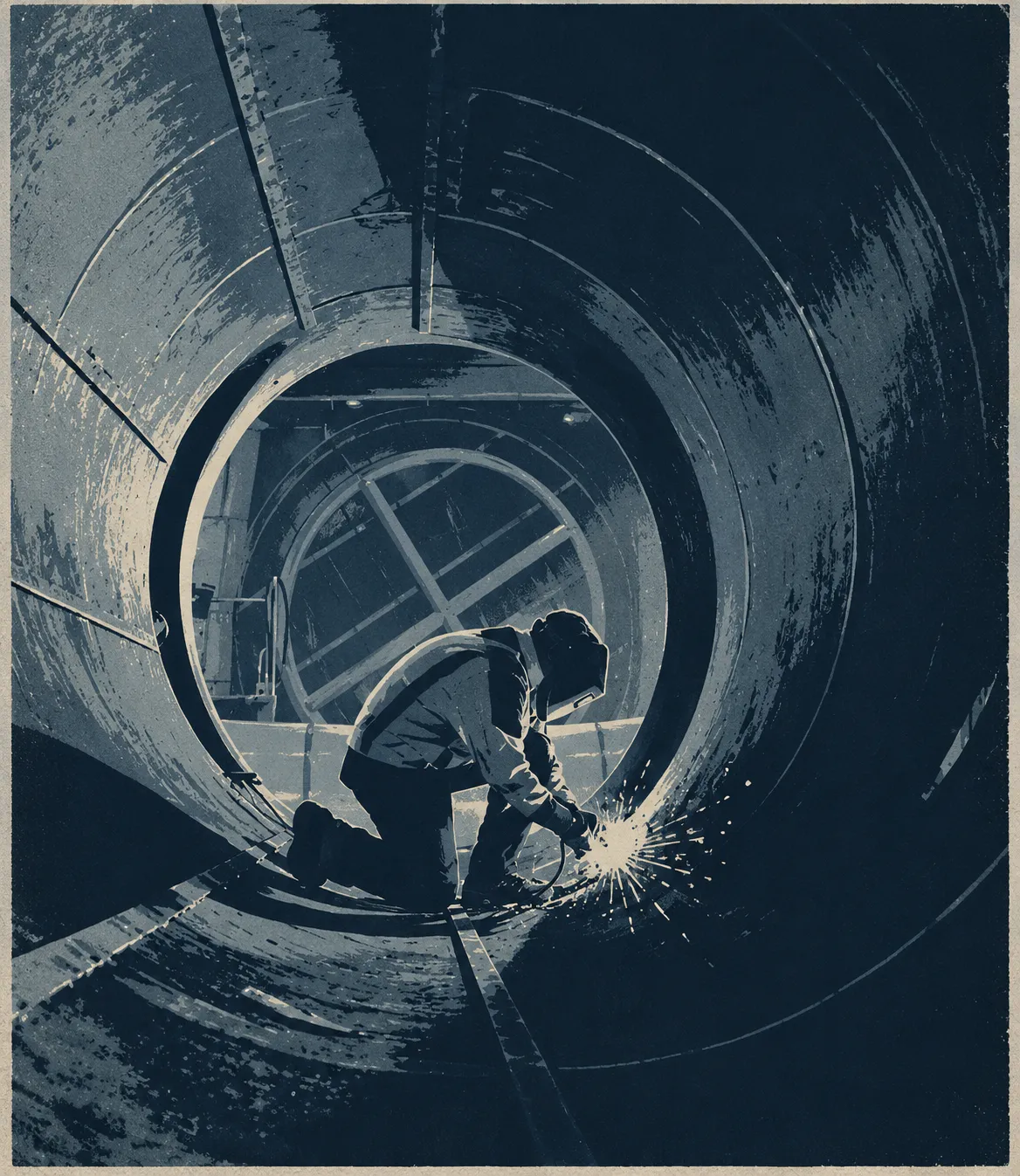
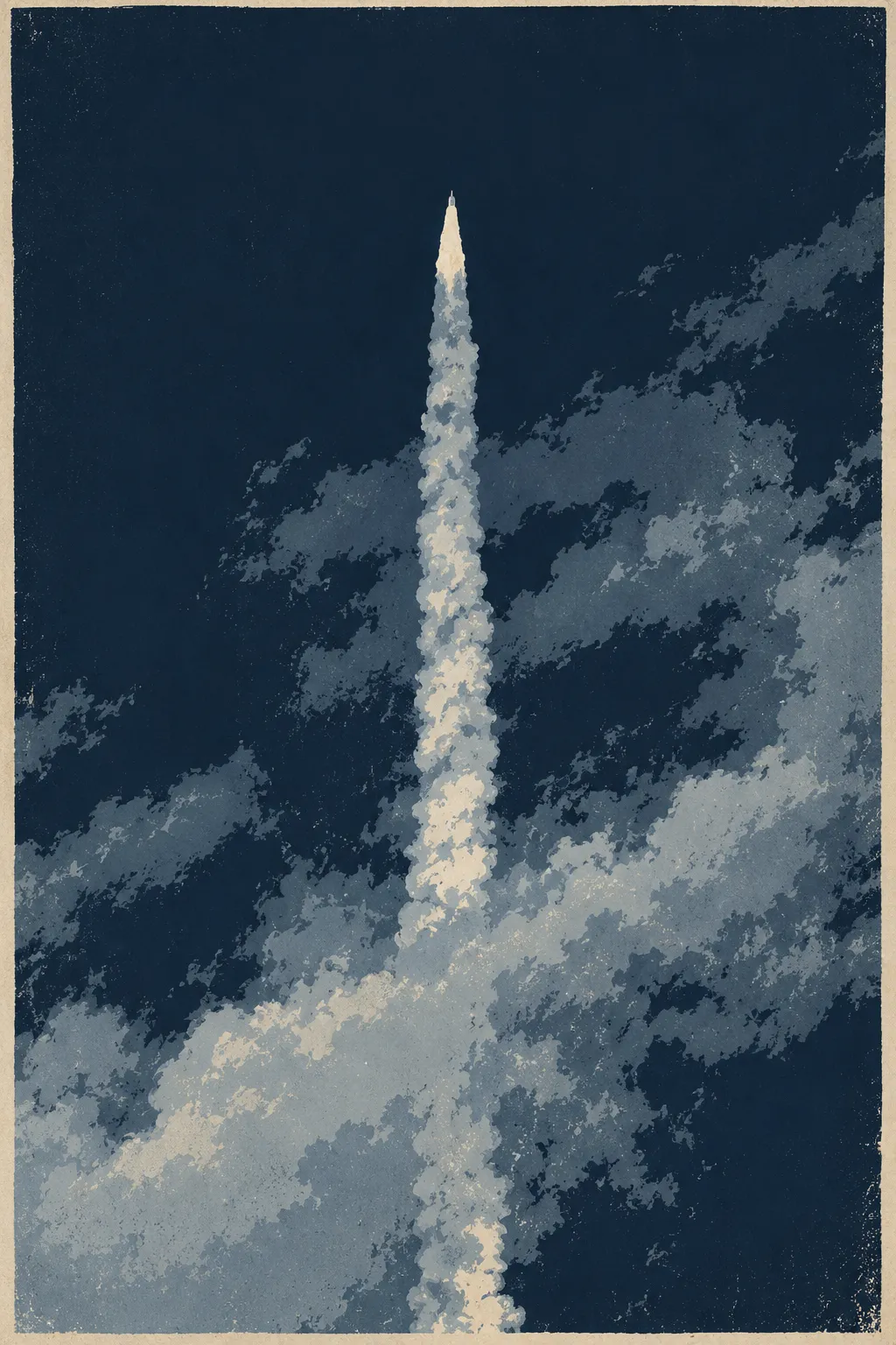
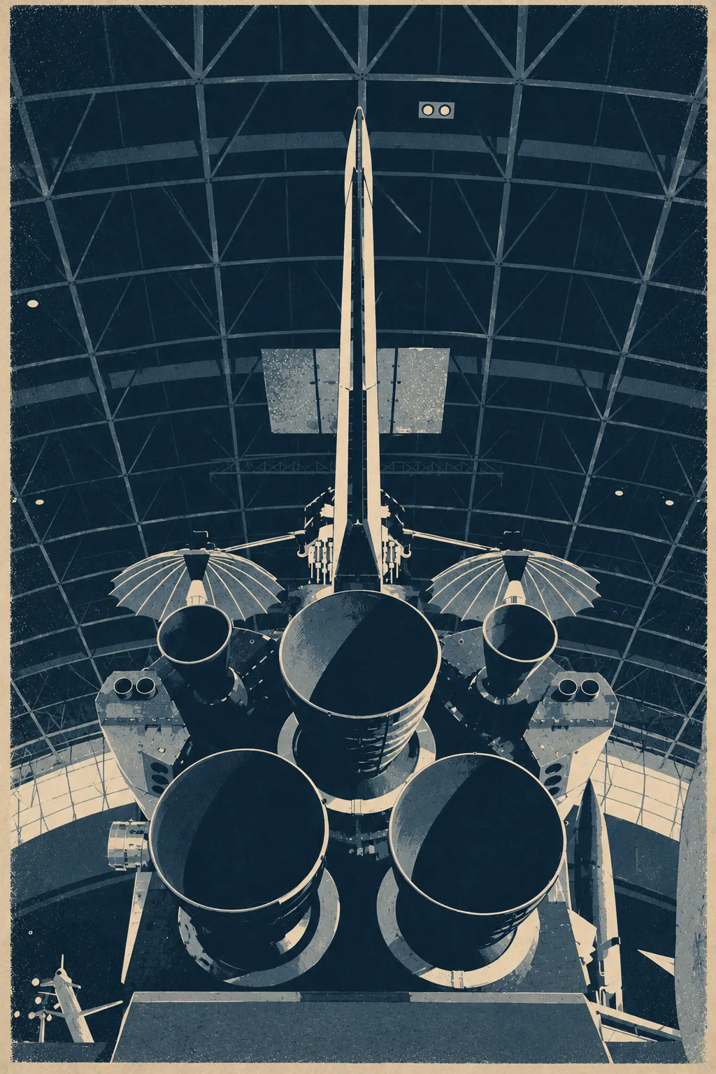
Photography is front and center in the brand system. It is dark and cinematic, with cool blue undertones, warm highlights, and strong focal points.
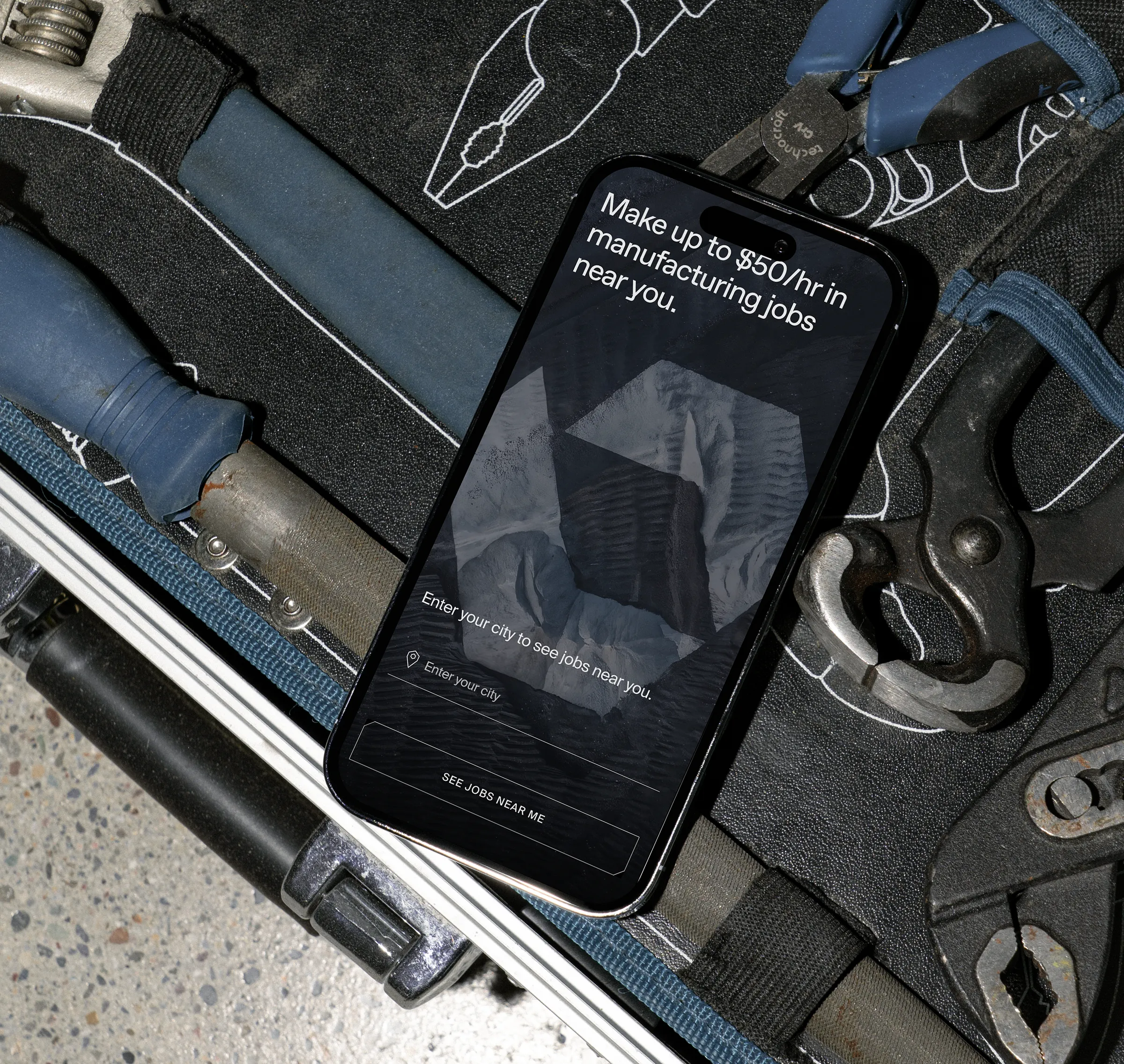
In product, we give that imagery room to breathe, using thin UI elements that let the photography take center stage.







'%3e%3cpath%20id='Union'%20d='M266.447%2087.0707L224.598%20159.564L174.33%2072.487L73.7866%2072.493L115.644%200.00420231L216.181%200L266.447%2087.0707Z'%20fill='%237B858F'/%3e%3cpath%20id='Union_2'%20d='M5.29211e-06%20108.226L41.8486%2035.7329L118.816%20169.055L219.36%20169.049L177.503%20241.538L76.966%20241.542L5.29211e-06%20108.226Z'%20fill='%237B858F'/%3e%3c/g%3e%3cdefs%3e%3cfilter%20id='filter0_n_0_167'%20x='0'%20y='0'%20width='266.447'%20height='241.542'%20filterUnits='userSpaceOnUse'%20color-interpolation-filters='sRGB'%3e%3cfeFlood%20flood-opacity='0'%20result='BackgroundImageFix'/%3e%3cfeBlend%20mode='normal'%20in='SourceGraphic'%20in2='BackgroundImageFix'%20result='shape'/%3e%3cfeTurbulence%20type='fractalNoise'%20baseFrequency='5.4980006217956543%205.4980006217956543'%20stitchTiles='stitch'%20numOctaves='3'%20result='noise'%20seed='21'%20/%3e%3cfeColorMatrix%20in='noise'%20type='luminanceToAlpha'%20result='alphaNoise'%20/%3e%3cfeComponentTransfer%20in='alphaNoise'%20result='coloredNoise1'%3e%3cfeFuncA%20type='discrete'%20tableValues='1%201%201%201%201%201%201%201%201%201%201%201%201%201%201%201%201%201%201%201%201%201%201%201%201%201%201%201%201%201%201%201%201%201%201%201%201%201%201%201%201%201%201%201%201%201%201%201%201%201%201%200%200%200%200%200%200%200%200%200%200%200%200%200%200%200%200%200%200%200%200%200%200%200%200%200%200%200%200%200%200%200%200%200%200%200%200%200%200%200%200%200%200%200%200%200%200%200%200%200%20'/%3e%3c/feComponentTransfer%3e%3cfeComposite%20operator='in'%20in2='shape'%20in='coloredNoise1'%20result='noise1Clipped'%20/%3e%3cfeFlood%20flood-color='rgba(0,%200,%200,%200.25)'%20result='color1Flood'%20/%3e%3cfeComposite%20operator='in'%20in2='noise1Clipped'%20in='color1Flood'%20result='color1'%20/%3e%3cfeMerge%20result='effect1_noise_0_167'%3e%3cfeMergeNode%20in='shape'%20/%3e%3cfeMergeNode%20in='color1'%20/%3e%3c/feMerge%3e%3c/filter%3e%3c/defs%3e%3c/svg%3e)


'%3e%3cpath%20id='Union'%20d='M147.624%2048.2413L124.438%2088.4062L96.5874%2040.1613L40.8813%2040.1646L64.0721%200.00232828L119.775%200L147.624%2048.2413Z'%20fill='%23E4CEAD'/%3e%3cpath%20id='Union_2'%20d='M1.54019e-05%2059.9627L23.1861%2019.7977L65.83%2093.6648L121.536%2093.6615L98.3453%20133.824L42.6429%20133.826L1.54019e-05%2059.9627Z'%20fill='%23E4CEAD'/%3e%3c/g%3e%3cdefs%3e%3cfilter%20id='filter0_n_0_115'%20x='0'%20y='0'%20width='147.624'%20height='133.826'%20filterUnits='userSpaceOnUse'%20color-interpolation-filters='sRGB'%3e%3cfeFlood%20flood-opacity='0'%20result='BackgroundImageFix'/%3e%3cfeBlend%20mode='normal'%20in='SourceGraphic'%20in2='BackgroundImageFix'%20result='shape'/%3e%3cfeTurbulence%20type='fractalNoise'%20baseFrequency='6.5877785682678223%206.5877785682678223'%20stitchTiles='stitch'%20numOctaves='3'%20result='noise'%20seed='21'%20/%3e%3cfeColorMatrix%20in='noise'%20type='luminanceToAlpha'%20result='alphaNoise'%20/%3e%3cfeComponentTransfer%20in='alphaNoise'%20result='coloredNoise1'%3e%3cfeFuncA%20type='discrete'%20tableValues='1%201%201%201%201%201%201%201%201%201%201%201%201%201%201%201%201%201%201%201%201%201%201%201%201%201%201%201%201%201%201%201%201%201%201%201%201%201%201%201%201%201%201%201%201%201%201%201%201%201%201%200%200%200%200%200%200%200%200%200%200%200%200%200%200%200%200%200%200%200%200%200%200%200%200%200%200%200%200%200%200%200%200%200%200%200%200%200%200%200%200%200%200%200%200%200%200%200%200%200%20'/%3e%3c/feComponentTransfer%3e%3cfeComposite%20operator='in'%20in2='shape'%20in='coloredNoise1'%20result='noise1Clipped'%20/%3e%3cfeFlood%20flood-color='rgba(0,%200,%200,%200.15)'%20result='color1Flood'%20/%3e%3cfeComposite%20operator='in'%20in2='noise1Clipped'%20in='color1Flood'%20result='color1'%20/%3e%3cfeMerge%20result='effect1_noise_0_115'%3e%3cfeMergeNode%20in='shape'%20/%3e%3cfeMergeNode%20in='color1'%20/%3e%3c/feMerge%3e%3c/filter%3e%3c/defs%3e%3c/svg%3e)